

Data Storytelling: The Power of Narrative in Data Analysis


Humans have been telling stories for thousands of years. From the earliest cave paintings to modern blockbuster movies, storytelling has been a fundamental aspect of human communication and culture. In the business world, things are no different. In fact, businesses have been using stories to sell products and services for centuries. Advertisements and marketing campaigns often use stories to create an emotional connection with customers and persuade them to buy a product or service.
However, when it comes to data, the power of storytelling is often overlooked or underutilized.
Many businesses collect vast amounts of data on their customers, operations, and financials, but they struggle to make sense of it and communicate it in a way that resonates with their audience.
In this article, we’ll dive deep into data storytelling and its impact on business success. We’ll discover what valuable insights are hidden within your data and how you can effectively communicate them to engage and influence your audience.
What is Data Storytelling?
Have you ever tried to explain a complex data set to someone and seen their eyes glaze over? It's not easy, right? That's where data storytelling comes in!
Data storytelling is a powerful methodology used to communicate insights and information from data in a compelling and engaging way by constructing a narrative around it. Using data to tell a story is not just about creating pretty charts and graphs; it's about crafting a story that will resonate with your audience and bring the data to life. It's a combination of science and art, where data visualization and storytelling come together to turn complex data into a meaningful and impactful story.
Imagine a control tower that monitors and manages the entire supply chain process, from raw material procurement to product delivery. These systems collect and analyze vast amounts of data on inventory levels, transportation, production timelines, and customer demands.
Through data visualization, control tower data can be transformed into visually engaging charts, graphs, and interactive dashboards. For example, through a real-time dashboard, you can display the current status of inventory levels at different locations, the progress of shipments, and any potential bottlenecks in the supply chain.
Data storytelling can take this visualization a step further by crafting a narrative around control tower data. It may highlight the efficiency gains achieved by optimizing inventory management based on real-time data insights or showcase how predictive analytics helped identify potential disruptions and allowed for proactive measures to mitigate risks. By weaving together these visualizations and narratives, data storytelling brings the supply chain data to life, allowing stakeholders to understand the story behind the numbers and make informed decisions.
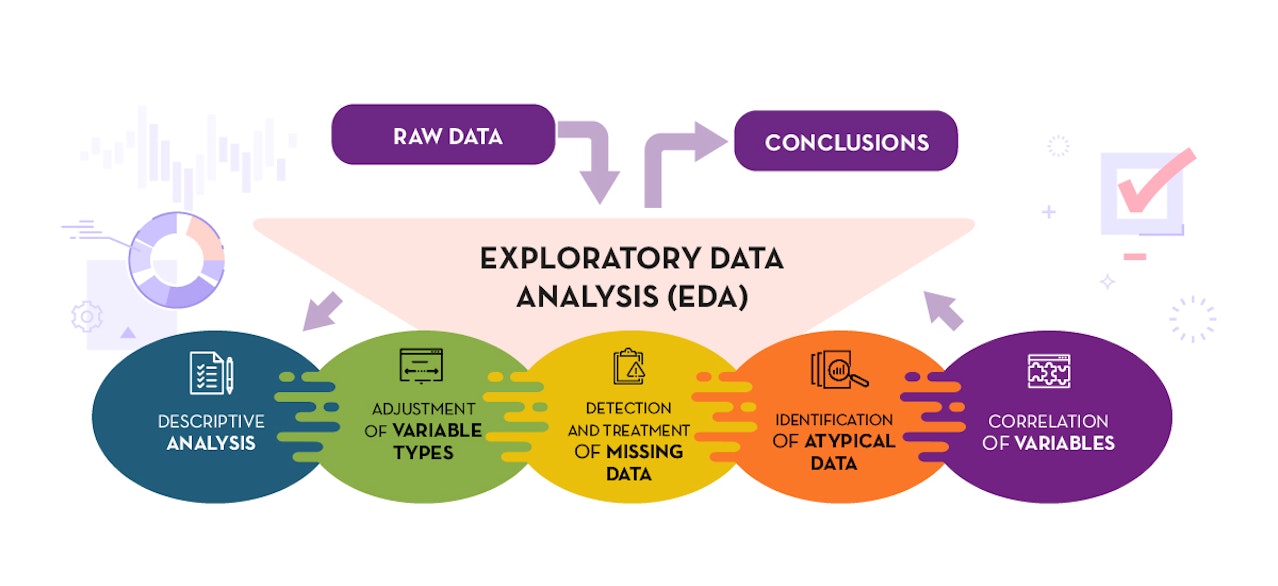
There are many ways to approach data storytelling, and it's not a one-size-fits-all solution. You need to consider your audience (whether it's stakeholders, executives, internal teams, customers, or partners), their level of familiarity with the subject matter, and what insights you want them to take away. One powerful approach to delivering compelling insights is Exploratory Data Analysis (EDA).

Datos.gob.es
EDA is used to analyze the data and discover trends and patterns or check assumptions in data with the help of statistical summaries and graphical representations. A compelling case in point is when we conducted an in-depth analysis of our client's sales database. What emerged from this EDA was a revelation that challenged their existing beliefs about market trends.
Traditionally, our client had been placing their focus on attracting many small customers, assuming it would lead to increased revenues. However, our EDA uncovered a surprising truth: most of their revenue actually came from their existing large customers. As a result, the client recognized the need to refocus their efforts on retaining and nurturing their long-standing, high-value customers. They realized that by diverting too many resources toward acquiring new customers, they risked losing their core revenue drivers. This strategic shift not only prevented potential financial losses but also improved their overall profitability and customer satisfaction.
What Makes a Good Data Story?
The purpose of data storytelling is to analyze unprocessed data and make audiences aware of its value. This process consists of three main components: data, narrative, and visual.
Lay the Groundwork With Data
The data component is the foundation of any good data story. It involves collecting, analyzing, and interpreting data to identify meaningful patterns, trends, and insights. This process requires a solid understanding of data analysis techniques and tools, as well as the ability to identify the most relevant and useful data sources. Good data should be accurate, reliable, and relevant to the story you’re telling.
Shape Your Story with Narrative
The narrative component of a data story is what gives the data context and meaning. It should be focused, concise, and interesting to your audience. The narrative should help the audience understand why the data is important, what it means, and how it can be applied. A good narrative is engaging, persuasive, and easy to follow without being overly technical or jargon-heavy.
See the Story with Visualization
Visualization is the third and perhaps most important element of a good data story. Effective data visualization can help you tell your story in a way that is easy to understand and engaging to the audience. It should be visually appealing, clear, and intuitive. The best visualizations help you highlight the key points of your narrative and convey complex information in a simple, memorable, and persuasive way.

Datameer
Benefits of Data Storytelling
In today's fast-paced business world, data storytelling has emerged as a superpower for organizations to make sense of complex data and turn it into actionable insights. However, even the most insightful data is useless if no one can decipher it. By weaving a narrative around complex data, data storytelling makes it more accessible and relatable.
This offers several distinct advantages to businesses, including improved decision-making, enhanced collaboration, and empowered data-driven culture.
Data storytelling brings all the distributed information from all the parts of the business in a way anyone can understand, from what your company’s pipeline is and what the number of your current leads is, to how satisfied your employees are. And when you’re able to comprehend the data and its implications, you can make more informed decisions. Data storytelling also helps identify patterns, trends, and correlations within the data. These insights can aid in the identification of potential opportunities or issues that may not have been apparent before. Moreover, by presenting the data in a visually appealing and easy-to-follow manner, your team members will feel more comfortable discussing the data and sharing their insights. This collaborative environment creates a collective understanding of the data, allowing for diverse perspectives and ideas to be exchanged.
Finally, by making data accessible and understandable to everyone, it cultivates a mindset of data-driven decision-making at all levels. This empowers employees to rely on data in their day-to-day work, driving innovation and effective problem-solving.
Matthew RamirezFounder of Rephrase Media We investigated the customer success journey during product onboarding and found that frustrated customers were most likely to churn within the first 30 days. To tackle this, we analyzed data to identify key frustrations. With a data narrative shared across sales, customer success, and marketing teams, we improved understanding of customer pain points and enhanced their experience.
Data Story Examples: Turning the Numbers into Meaningful Insights
Data storytelling breathes life into numbers by presenting them in a visual and narrative format. But how exactly are businesses using this powerful methodology? Let's explore a few real-world data story examples and see how companies are leveraging this approach to communicate insights, persuade audiences, and drive results.
Spotify
You’ve probably heard of Spotify Wrapped - a musical year in review based on the songs you listened to.
Spotify combines personal listening data with clever visuals and storytelling to create a unique experience that engages millions of users each year. From customized playlists to shareable social media graphics, Spotify Wrapped uses data storytelling to help listeners reflect on their musical journey and discover new artists and songs.


Vida Creative
Instead of only housing valuable customer data, Spotify takes advantage of its millions of listeners’ data and creates a fun story that draws excitement and interest from its customers and their friends. The success of Spotify Wrapped demonstrates the power of data storytelling to create a personal connection with users and deepen engagement with a brand.
Johns Hopkins University
Since the beginning of the COVID-19 pandemic, Johns Hopkins University has collected the most current data to create a real-time dashboard that displays easily digestible data. The dashboard features animated videos, interactive maps, and widgets.


International Journal of Health Geographics
Serving as a destination for current information, the institution draws attention to itself and engages the wider audience while showing how technology and innovation are being used to improve healthcare.
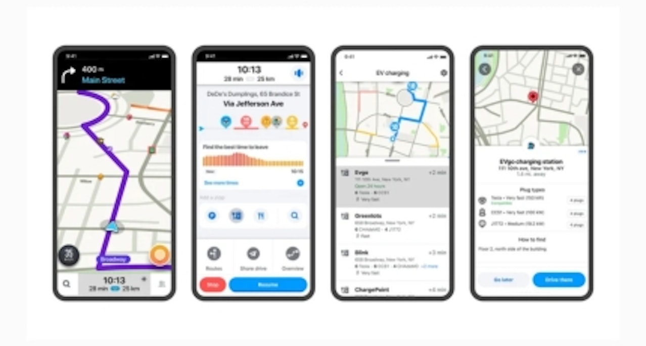
Waze
Few examples are as remarkable as the journey of Waze, a navigation app that harnessed the power of data to revolutionize the way we navigate our world. At its core, Waze is a community-driven app that relies on real-time data collected from millions of users to provide accurate and up-to-date navigation information. By crowdsourcing data on traffic, accidents, and road conditions, Waze has created a dynamic platform that empowers users with valuable insights and alternative routes, enabling them to navigate efficiently and save time.

Tech Crunch
But Waze didn't stop there. They recognized that the data they collected had the potential to tell captivating stories beyond individual navigation. They transformed their dataset into compelling visualizations, heat maps, and interactive dashboards that revealed traffic patterns and congestion hotspots.
Turning Insights into Action
It's no secret that businesses today are collecting more data than ever before, but many are missing out on the opportunity to use this data to its full potential. By simply presenting raw data without any context or story, companies are failing to engage and connect with their audiences and missing out on potential opportunities to drive growth and revenue.
Data storytelling is the missing link that can bridge the gap between data and meaningful insights.
Subscribe to our newsletter
You’ll receive insights, strategies, and best practices that help you succeed in adopting and implementing AI & Data. Only what matters. Once a month.